All Posts in Mobile Design

07/08/2015 - 6 comments

Branding Meets Material Design

material design

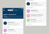
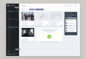
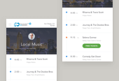
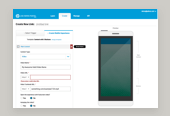
Since Google's release of their Material Design visual language, the mobile design industry has been experiencing a quick pivot towards somewhat universally adopting to these guidelines. As a product designer, I'd like to challenge this pivot and urge other designers/organizations to do the same. I've noticed an unfortunate trend wherein organizations are sacrificing their branding and voice in exchange for standardization. While the trend may indeed lead to an improved mobile experience overall, I think that blindly adapting to the guidelines set forth by Google without some deep thought is a mistake.

Read more

01/29/2015 - No Comments!

Mobile Testing w/ Edge Inspect

repeat-devices

Adobe Edge Inspect

Edge Inspect is an excellent application for web developers and designers alike who need to preview their content across multiple mobile devices. It makes a once manual and fairly painful process relatively quick and seamless. Its most notable features include the ability to navigate a the web from one machine with many mobile devices following, snapping mobile screenshots and inspecting the code on mobile screens. All of these features combined end up saving much valuable product design time.

Read more

11/15/2014 - No Comments!

From iOS to Android

ios-to-android illustration

A Fanboy is Born

In a sea of clunky PC plastic, it was easy to fall in love with iOS upon purchasing my first Mac Mini in 2006. Upon entering my college dorms, my newfound love for iOS quickly grew as a new friend happened to be an Apple employee and was able to unleash the power-user within me. After years of fighting with PC machines, I warmly welcomed the sleek product design, artistic applications and delightful user experience.

Read more

06/26/2013 - No Comments!

The Importance of Testing on Mobile Devices

Today, the web is everywhere and additional devices are continuously being released. Each of these mobile devices has a unique interaction pattern and physical form factors that can lead to design and development challenges. By testing your software early and often with actual devices, you'll be more successful in developing device-agnostic experiences across them all. As designers, we're responsible for familiarizing ourselves with the multitude of devices our software may experienced on by actual users and working towards optimizing each of these experiences. It's time to put down your iPhone and get out of your comfort zone.

Read more

05/30/2013 - No Comments!

Multi-Device Web Design & Beyond

San Diego Web Design Conference

On the final day of San Diego's 2013 An Event Apart conference, Luke Wroblewski delivered an all day workshop on multi-device web design. Luke managed to deliver a consistently captivating presentation throughout the seven hour workshop. He presented a vast amount of information, (nearly a 250 page workbook!) and practical methods for putting these responsive web design techniques to use. Most importantly, he spent much of the session discussing the history of this interesting subject, imparting the knowledge of how we got this point, justifying the current need for multi-device websites. Here are my notes from his session:

Read more

05/28/2013 - No Comments!

OMG. We Need a Mobile App, Notes

Today's Nerdery webcast was hosted by Ryan Carlson and centered around mobile application design best practices. Specifically, Meghan Casey, content strategist, and Hannah Grossman, user experience designer, explained and answered the audience's questions regarding their workflow when a client comes to them with the ambiguous statement, OMG. We need a mobile app! Both Meghan and Hannah currently work at the Nerdery.

Read more