Since Google's release of their Material Design visual language, the mobile design industry has been experiencing a quick pivot towards somewhat universally adopting to these guidelines. As a product designer, I'd like to challenge this pivot and urge other designers/organizations to do the same. I've noticed an unfortunate trend wherein organizations are sacrificing their branding and voice in exchange for standardization. While the trend may indeed lead to an improved mobile experience overall, I think that blindly adapting to the guidelines set forth by Google without some deep thought is a mistake.
Let me first state that I respect the Material design guidelines. I know first-hand how intensely difficult it is to identify, organize and quantify the elements that make up an interface. It is difficult, meticulous work for a single application, let alone an entire "Google" of products; and they really nailed it. Material Design is a solid system, well-designed and clearly articulated in their standards. In a classically Google approach, the look and feel has been somehow quantified, and driven by reason/data.
Making Material Design Your Own
Certain apps have adapted Material design in a fantastically subtle way; picking and choosing which elements or principles to adapt into their existing interfaces. MD can really force a layout to pushes the limits of simplicity, forcing the designer to leave only what is necessary. It reminds me of a mobile-first approach.
So, what are some ways in which folks are getting creative and merging the MD principles with exiting design solutions? I know that this list may seem very basic, but that's just the point. MD aims to bring folks back to their roots as visual designers. Less has always been more.
Typography
As has always been the case, typography speaks volumes for a brand when other branding elements are restricted. The right typeface can evoke unconscious feelings and recognition in the user, carrying the larger brands emotion across to the constraints that come along with using Material Design in the mobile space.
The New York Times app is an especially successful example of using typography to stand out amongst in the MD space. It's bold, and frankly, unique typographic qualities borrowed from the printed newspaper transition well to it's online and mobile properties. 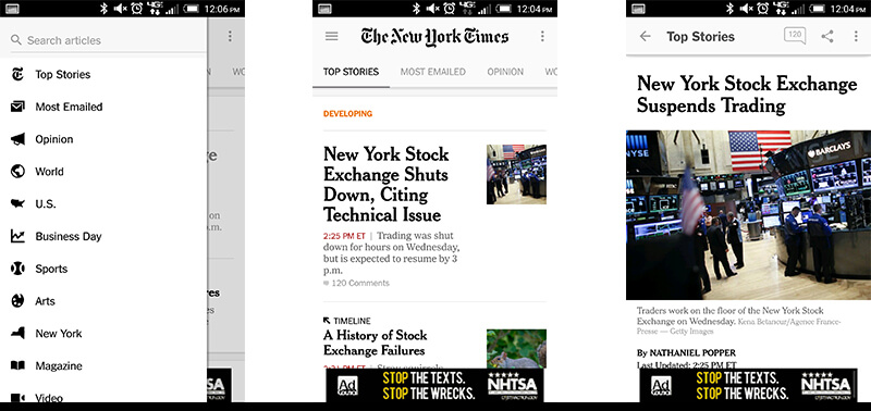
Iconography
Another way to differentiate an interface is through the use of distinct iconography. Bringing a brand's distinct illustrative styles into a Material Design inspired interface can foster a bold look. Coinbase is very successful in this space, bringing their custom thin-lined icons into the interface. I'm sure dropping in some boilerplate Glyphicons or Font Awesome icons would have saved time, taking this extra step helps them to stand out and feel fresh. 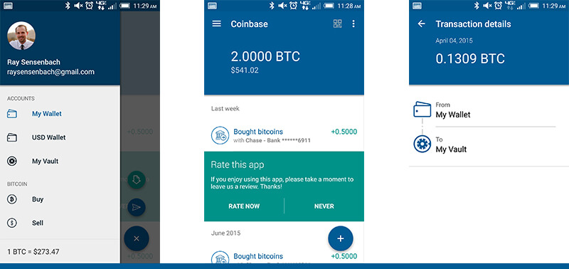
Color
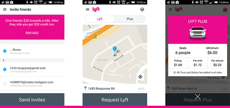
Lyft is one of many examples of a brand coming through and enhancing MD through color. Lyft's distinctive Pink color is used as a Call-to-action throughout the app, drawing the user's eye to key actions and value-add elements on the interface. While some of the apps layouts may be reused or upcycled directly from Material Design, I either don't notice or don't care, because the use of color makes it feel very branded and custom.
Motion
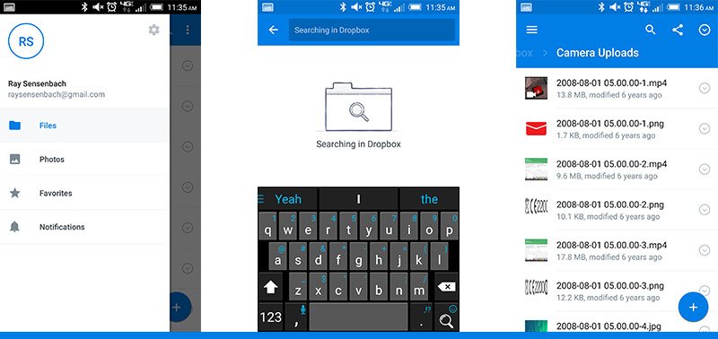
The Evernote & Dropbox mobile apps are especially successful because they use a combination of all of the above tools along with subtle animations. This use of motion is critical in reinforcing their specifically whimsical brands. Certain elements bounce about, while others linger slightly longer than you'd expect, all subtly adding that fun elements, which can be so difficult to quantify. 
When To Conform
Adopting somewhat blindly to the Material Design guidelines can be the right move, in some cases. I believe that these cases include proofs of concept and any "just get shit done" tools where function clearly trumps form. Additionally, if you're on a small team without the resources or justification to obsess over the more intricate of details, by all means, start with a blank material slate and incrementally improve. Agile team's software development cycles especially lend themselves to this last exception, where the whole solution may be scrapped for any number of reasons.
Final Thoughts
Material design is here to stay and will hopefully continue to evolve in the way of usability, not alongside coming temporary design trends. As a designer, I urge others to focus on the user flows and how to funnel users in such a way that they can complete their most common tasks effortlessly. Also, seek out and invent those micro interaction opportunities to unexpectedly inject your brand both visually and emotionally into work. A little personality can go a very long way in differentiating and leaving that emotional connection behind in a user's psyche.