

In today's mobile-first and responsive web design-crazed climate, it can be easy to neglect the basics. While we learn how to utilize & bend CSS3 media queries to create more immersive web experiences, it can be easy to neglect the original media query, print.
A print style sheet's purpose is to improve the quality of the printed version of your website by adding custom, printer-only styles. When printing a web page, you don't need any interactive elements that are not accessible in a material world. With a printer style sheet you should eliminate or "zero out" these unnecessary elements and focus on the readability of your content. This post briefly describes how to add painless styles to your site that are sure to have a big impact.
A Few Clarifications
We'll be using absolute values, pts/in/cm/etc, as these are more suitable for the print medium. While pixels and ems are standard for the web, you'll want to reference a physical unit when styling your website for print. As a base reference, remember that 16px = 12pt.
Also, you'll want to transform your screen colors to something more printer-friendly. Resist the urge to use varying shades of gray, as these require composite ink mixing, and actually use more of the user's precious ink than a full 100% black. In addition, while minutely different shades grays can be easily discerned on-screen and used to create visual hierarchy, this is usually lost in print. Each printer renders differently in this space and the differences can cause confusion or reduce the impact of your decisions.
We'll also want to use the !important rule to be sure our styles override all others. Okay, now that we have the basics out of the way, let's get started.
1. Define the Page Layout
The first step is to define the physical margins, or safe area, for your printed page. Generally you can assume the target media will be letter, or A2 size sheet (depending on your country). Through some brief testing, I've found that anywhere from 0.5"-0.75" is a safe bet here.
Within our print-specific media query, define this margin with an @page declaration.
@media print {
@page {margin:0.75in;}
}
2. Neutralize Web Styles
Next, we'll effectively neutralize layout styles applied within our HTML. Use the asterisk(*) selector to target everything and apply the following CSS.
@media print {
* {color:black!important;font-family:Georgia,serif!important;font-size:11pt!important;line-height:1.3;width:auto!important;float:none!important;overflow:visible!important;}
}
You'll need to tweak this slightly based on your desired outcome and specific website, this is just an example.
3. Hide Unnecessary Elements
Off-screen we'll hide content areas and HTML elements that simply have no place outside of the on-screen experience. This can include everything from social media links, advertisements, navigation, search bars, pagination, and much more. This really depends on your website's content.
Add a single line of CSS listing all of these elements/classes/ids and use a basic display:none; rule to remove these from your print experience. Here's our stylesheet thus far:
@media print {
elements, .your-class, #your-id {display:none;}
}
4. Remove Backgrounds
Next, you should tackle background images or reversed text areas. By using the shorthand CSS *{background:transparent;} property, you can simultaneously change all background colors to white, and eliminate any background images. Be aware, this will eliminate each and every background image on your website, which may have unwanted effects. Double-check that you haven't hidden any primary branding elements, and remedy this as needed with additional, more specific, background rules.
@media print {
* {background:transparent!important;}
}
5. Color Links & Reveal URLs
Printing a link is laughably useless if the URL remains masked. Here we can use the CSS pseudo class ":after" to drop in the URL right next to the link. This is the one place I recommend adding some color to the page, as the links will stand out.
@media print {
a,a:visited{color:#1abc9c !important;text-decoration:underline;}
a:after,a:visited:after{content:" (" attr(href) ")";} a abbr[title]:after,a:visited abbr[title]:after{content:" (" attr(title) ")";}
}
6. Avoid Distorted Images
Here, we'll give images and object elements a maximum width. Most images are set to width:100% when implemented within a responsive environment. This doesn't exactly translate to the printed page; as small images run the risk of wasting ink and becoming pixilated.
@media print {
img,object{max-width:400px!important;}
}
7. Reveal Additional Information to the User
You may choose to again use the CSS pseudo class ":after" to reveal additional content to the user. I chose to add my name to the meta data at the beginning of each article, as I am printing little to no personal branding. I also included a notation at the very bottom of the page, thanking the user for printing the article. A little emotional design can go a long way.
@media print {
.byline:after {content: "by Ray Sensenbach on www.RaySensenbach.com";display:block;}
.copyright:after {content: "Thanks for printing my article! Cheers.";display:block;}
}
8. Refine Your Specific Styles
Finally, add any finishing touches as your content patterns may require. For this blog, I regularly use h1, h3, h3, p, blockquote and hr elements in my blog posts. Therefore, I've written specific print style in reference to each of these, in order to maintain my visual hierarchy on the printed page. Tables can usually use some quick refinements when printing comes into play, to enhance their legibility. I highly recommend you do some cleanup work here as well.
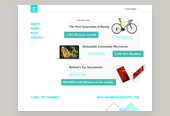
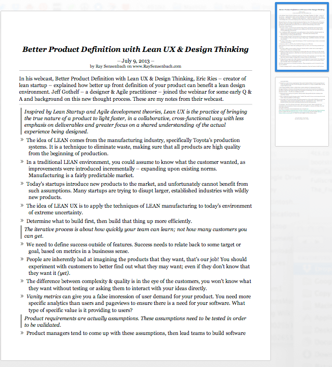
Here you can see what this blog looked like without any print stylesheet written. Absolutely positioned elements broke the layout, text is huge, colorful ink drained my print cartridges, etc, etc. An altogether bad situation.
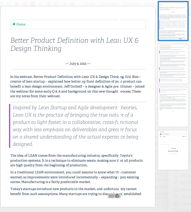
Just a few lines of code later, I have this nicely styled layout on my printer. A full two pages less to print the same post!
Try printing this article out to experience a my painless print stylesheet in action! I wrote the CSS in about 10 minutes, worth it. It may not be beautiful, but it gets the job done, is incredibly legible and wastes the least amount of ink.