
Droplr User Onboarding
Primary Challenge
My challenge in this project was to improve the conversion rates of new users from casual creators to engaged and paying customers. Analytics revealed that those users who created more than 10 drops were significantly more likely to see the benefits of the application and become paying, long-term users.
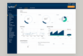
The average Droplr user interacts with 2-3 of their products to best streamline their digital workflow. I was tasked with first redesigning the user on-boarding flow to boost conversion rates and engage new users. Additionally, I provided a new visual design for the dashboard in an effort to define the overall interface language for the company's full suite of products.
USER ON-BOARDING FLOWS
My first step was to document the product's existing user flow and dive into the company's analytics. Next, I defined a product strategy that I would use as a reference in my redesign of the flow.
My documentation of the product's legacy on-boarding flows.
Guiding UX Principles
01
SEAMLESS FLOW
Droplr as a product stands apart from its competition by staying simple and doing a few things very well. I am aiming to reinforce this notion throughout the user on-boarding flow, making it a seamless process for all new users.
02
DEMONSTRATE VALUE
Droplr's value as a product is simple in practice, yet difficult to describe simply. To remedy this and gain more traction with new users, we will consistently demonstrate our real world value to users. Clear examples, social proof and use cases for the product in a everyday workflows are encouraged wherever possible.
03
DELIGHTFUL PROCESS
In correlation with a seamless flow, the brand personality of Droplr is lighthearted, helpful and engaging. The onboarding flow should return to these values whenever possible, transforming an everyday lackluster process into one that is delightful and reinforces a positive brand experience with our new users.

My optimized on-boarding flow, ready for prototype creation and user testing.
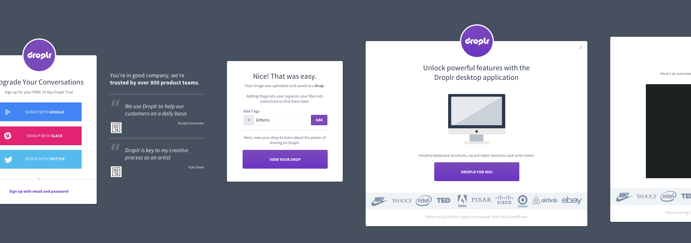
PROTOTYPING & USER TESTING
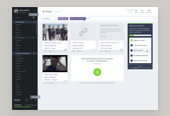
Next I translated my optimized user flows into a clickable prototype in preparation for user testing. Each screen was wireframed and included persistant data such as the user's name and account informaiton, providing a realistic protoype experience for testers.
A birds-eye view of the wireframed screens in Sketch.
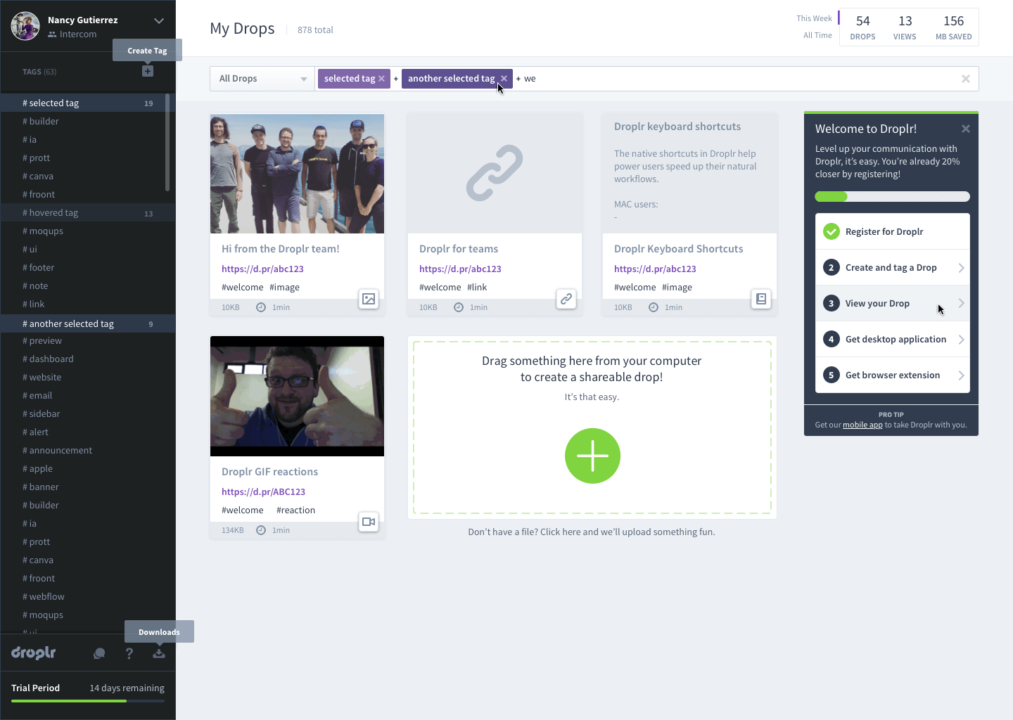
ITERATIONS & UI DESIGN
With the user testing results in-hand I was able to further optimize the flow, clarifying any points of confusion that were revealed through testing.
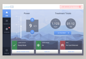
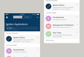
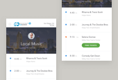
Next, I took the wireframes and brought them to full graphic fidelity. I skinned the entire Droplr dashboard including the many new on-boarding states and modals which were designed to familiarize new users with the product. Examples of social proof are now found throughout the flow and I guided new users to download the necessary applications by demonstrating their value to a user's process.
Warning: implode(): Invalid arguments passed in /home/q2jbh94teh6a/public_html/wp-content/themes/semplice/partials/project-panel.php on line 28