Link Creation Studio
01
User Understanding of Complex Verbiage
02
Design for Emerging Technology
03
Consistent Design Between 3 Teams
THE CHALLENGE
Verbiage
As an emerging technology, labeling and verbiage throughout this application in a way that was relevant and understood by our new users posed a major challenge.
Grasping the core concept of the Link Creation Studio technology required our prospective users to understand some very unfamiliar terms including trigger, link and payoff.
GETTING TO WORK
I approached this initial challenge with extensive user testing and cross-functional brainstorming sessions with my team.
The initial design evoked notions of print and printing while I hoped to highlight the mobile and digital aspects. Iterative user testing revealed that the inclusion of an image boosted user’s understanding. Many users even asked to see a short video in my testing sessions for further understanding.
Extensive testing of this verbiage revealed the following:
- I needed to be clear and direct with what users can do on the website.
- High-level vague descriptions were causing confusion with users.
- Shift messaging away from the words paper and printing.
- Lead descriptions with digital watermark to shift focus away from QR codes.
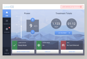
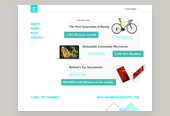
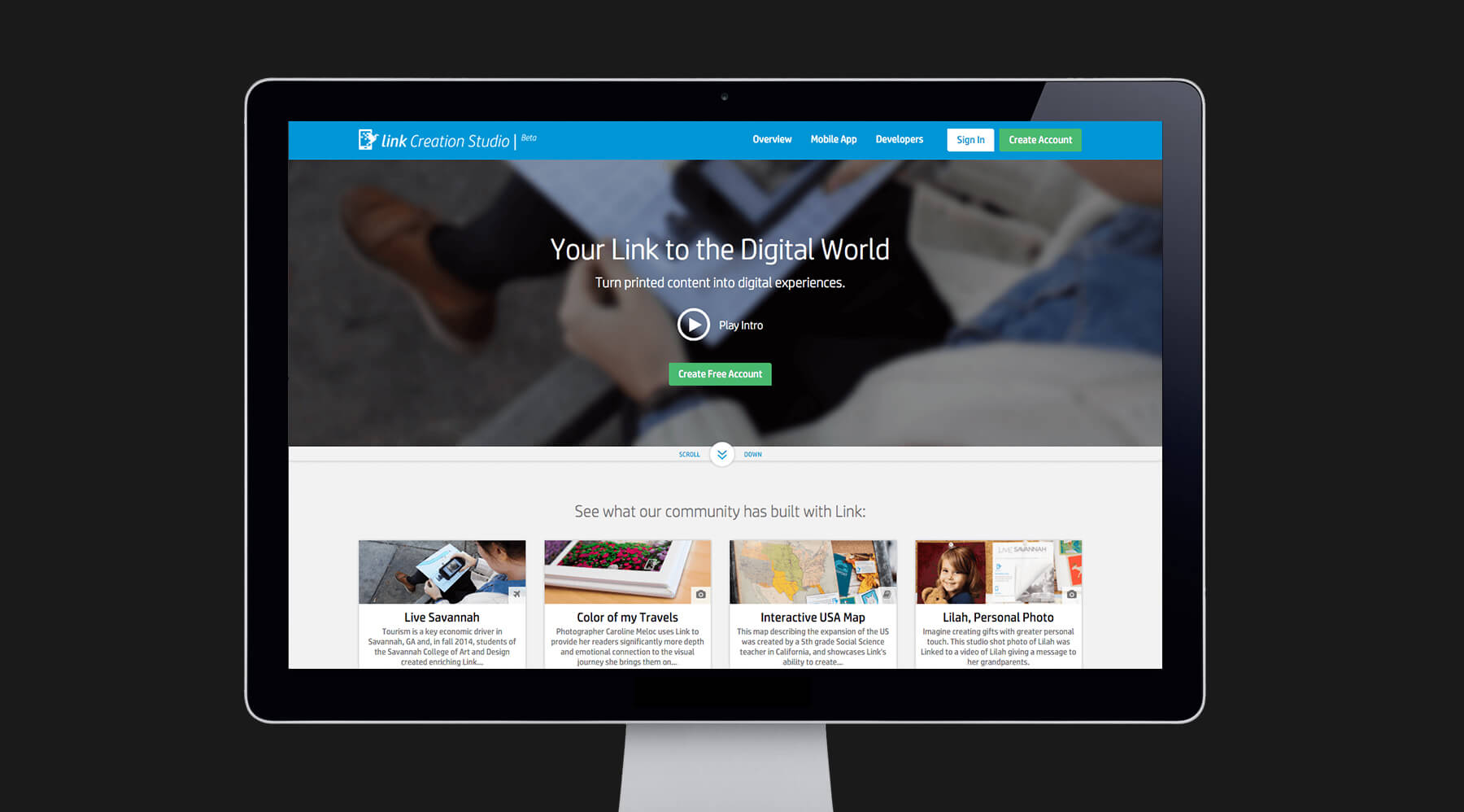
Initial landing page wording & layout
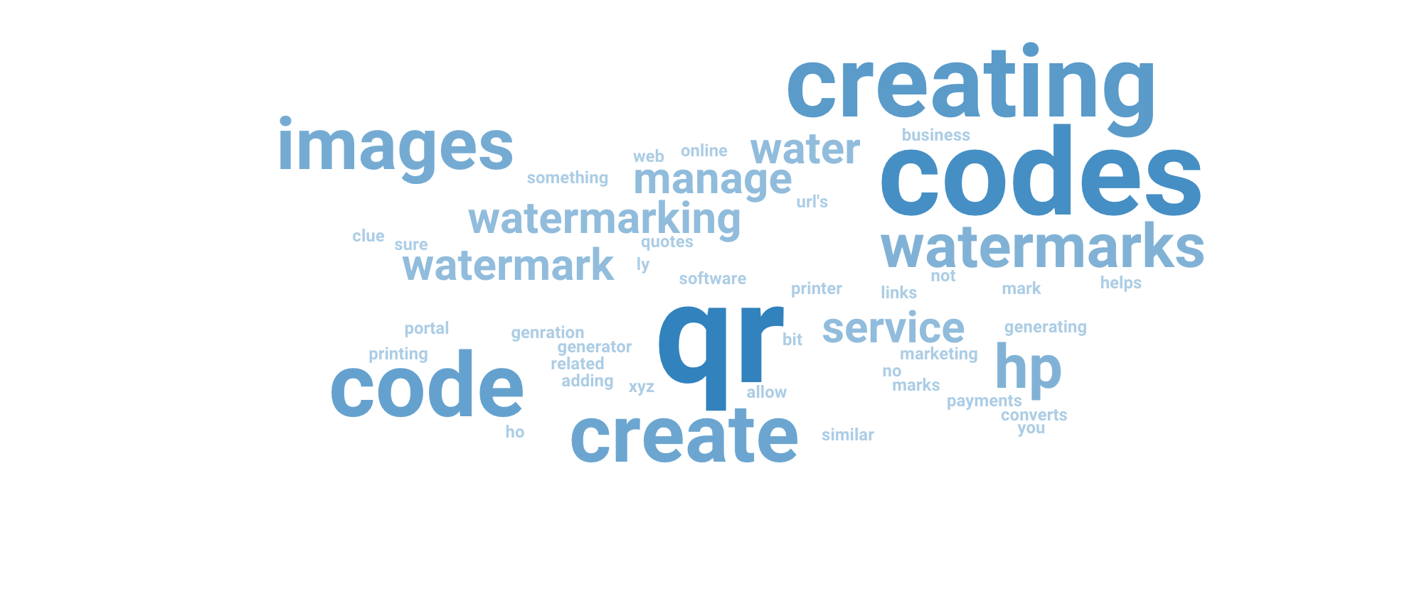
Initial test results focused on QR codes and print
THE OUTCOME
Adding a more direct and appropriate image along with tweaking the primary CTA message resulted in better user-recognition of the core watermarking technology.
Later, I worked with other designers to incorporate a video showing the scanning interaction itself. This video was a big hit with new users as seeing makes this concept much easier to understand.
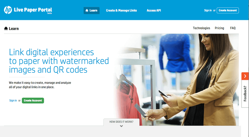
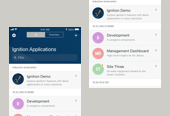
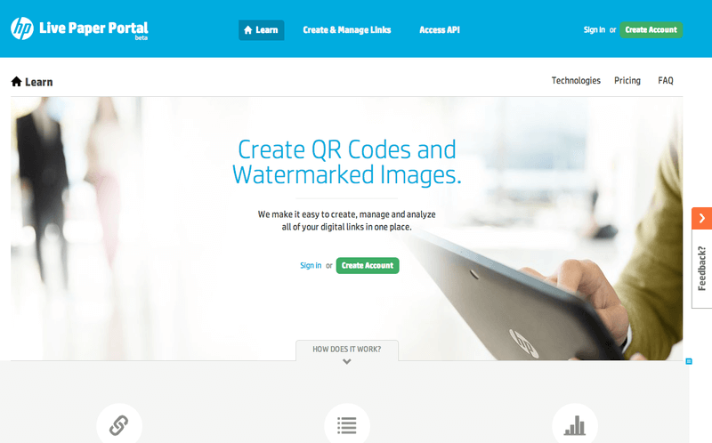
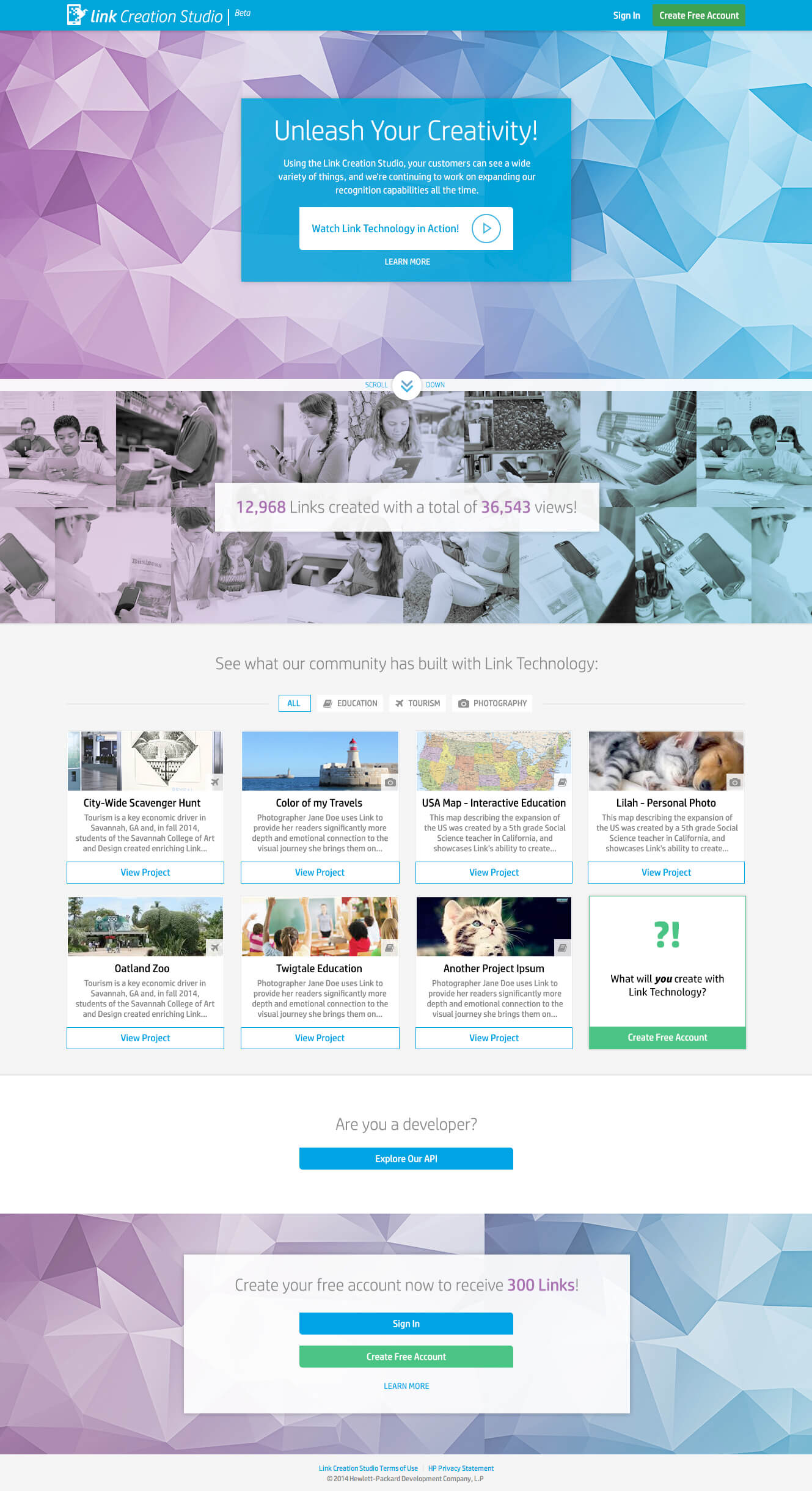
Resulting layout and verbiage
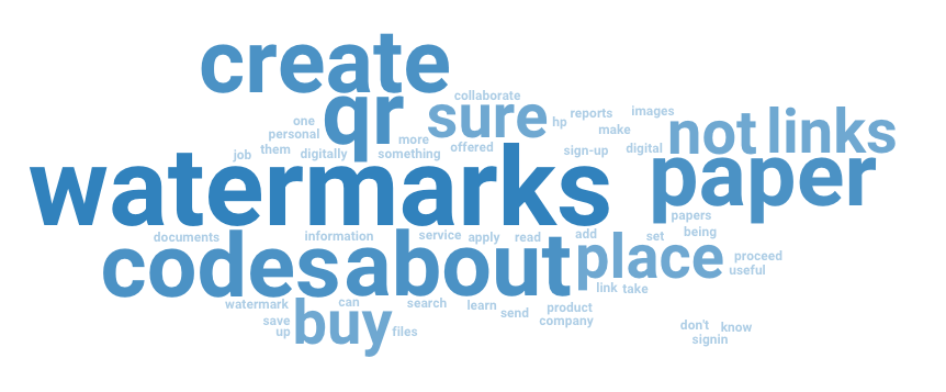
Test results focused on watermarks
THE CHALLENGE
Design for New Technology
To build this experience for their own customers, users need to both create a trigger image and the complimentary mobile experience.
My interface design needed to clearly explain this process while also enabling an intuitive creation flow.
GETTING TO WORK
After sketching and post-it sessions with the larger team, I iteratively built interactive prototypes. These were designed with many different user flows in mind and were tested at the lowest possible fidelity. This enabled me to test a wide array of flows and ideas while still moving fast with my agile development team.
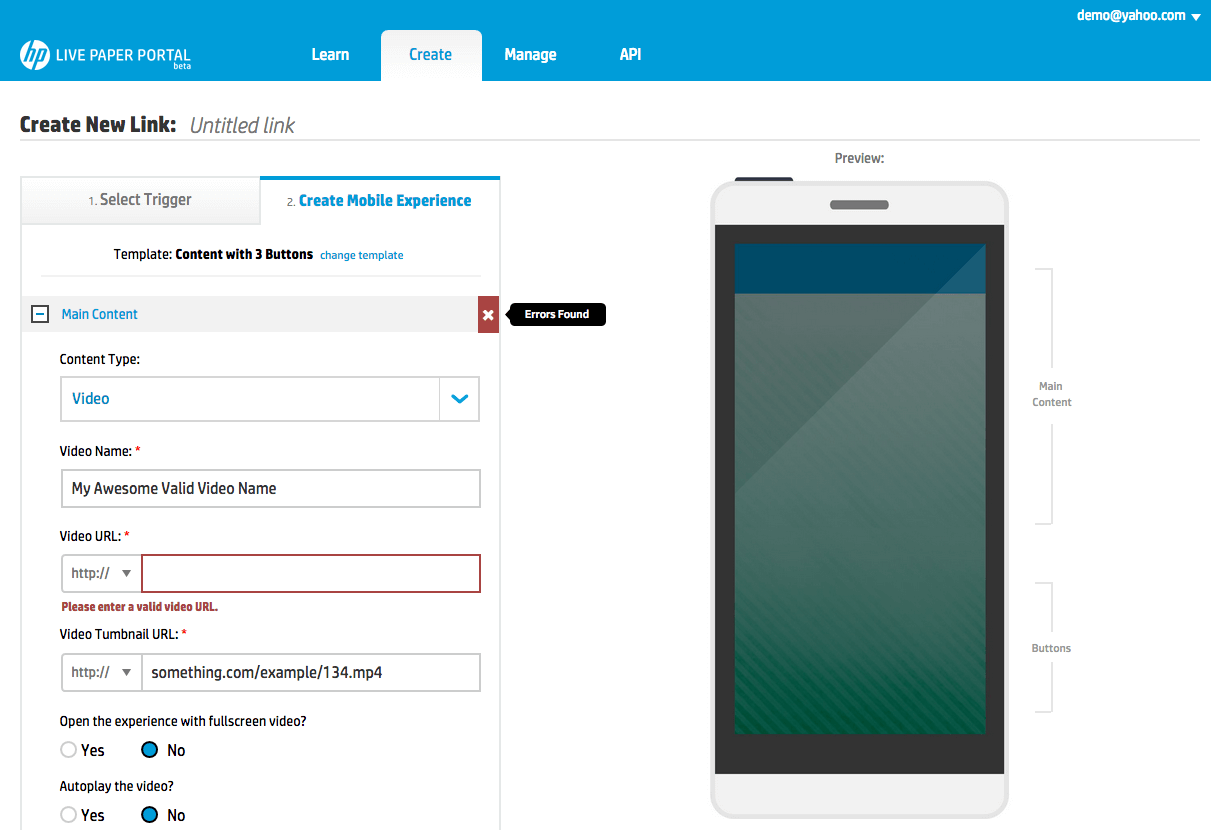
Each prototype was then validated in task-based user testing sessions which I conducted within our defined target audience. These sessions indicated that users succeeded most often when they saw a checklist of all items they needed to complete alongside their current progress in the larger creation flow.
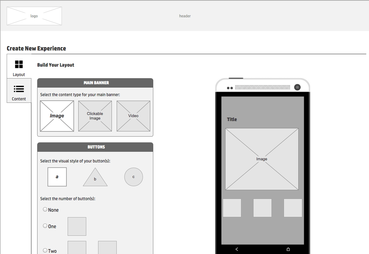
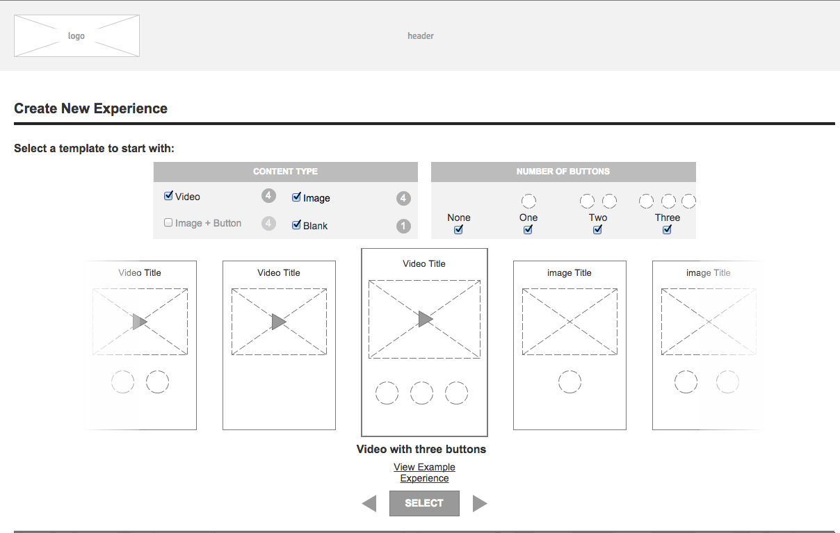
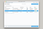
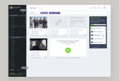
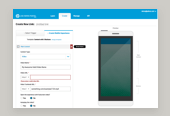
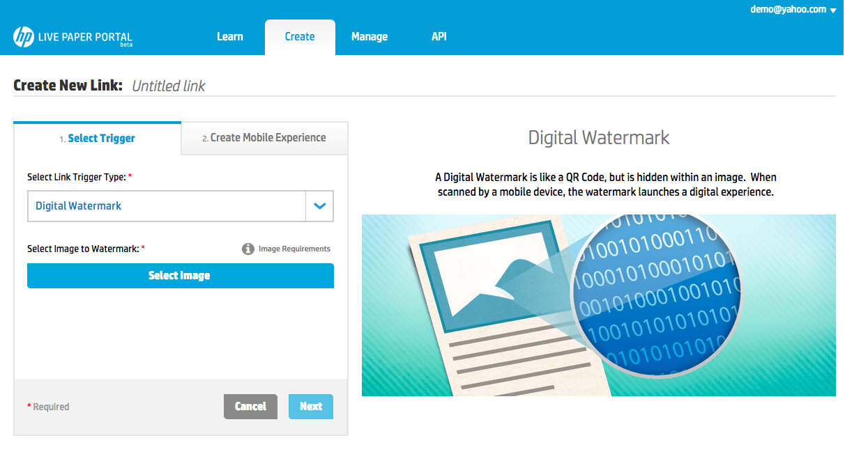
Just a few of the many interactive prototypes tested
THE OUTCOME
The final design solution consisted of a new creation user flow which incorporated a tabbed interface with a checklist. The final interface was validated through user testing sessions. New users were able to consistently complete the primary and secondary tasks related to link creation without any stoppages.
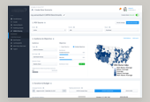
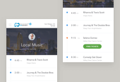
Resulting interface designs
THE CHALLENGE
Design Consistency
Consistency in design and messaging between three geographically separate teams posed a challenge for my design team. We were building this web application across three continents including the USA, India and Brazil!
In order to keep all designers on the same page and avoid rework when it came to simple interface elements such as buttons or form elements, I decided to create a living style guide for this project.
GETTING TO WORK
Through strategy and open communication channels, I managed to maintain a consistent design language across our three teams.
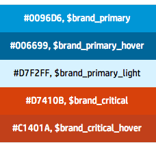
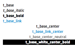
I did so by creating style guide documentation for this project. The documentation was accessible to each geographically separate team at any time and contained core elements of the web application including: color, typography, forms elements, and other core design patterns.
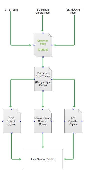
My defined strategy for a common style sheets
THE OUTCOME
The final style guide was eventually published on our public web page and was tied directly to the Sass stylesheets. I personally wrote the base styles for this library, over 3000+ lines of Sass code which would dynamically compile into to our production code on a daily basis, keeping each team up to speed.
I've published a version of the style guide here:
Sample elements from the final style guide
Warning: implode(): Invalid arguments passed in /home/q2jbh94teh6a/public_html/wp-content/themes/semplice/partials/project-panel.php on line 28