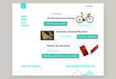

Post Print Experience
01
Device Agnostic, Mobile Design
02
Responsive Design Specifications
THE CHALLENGE
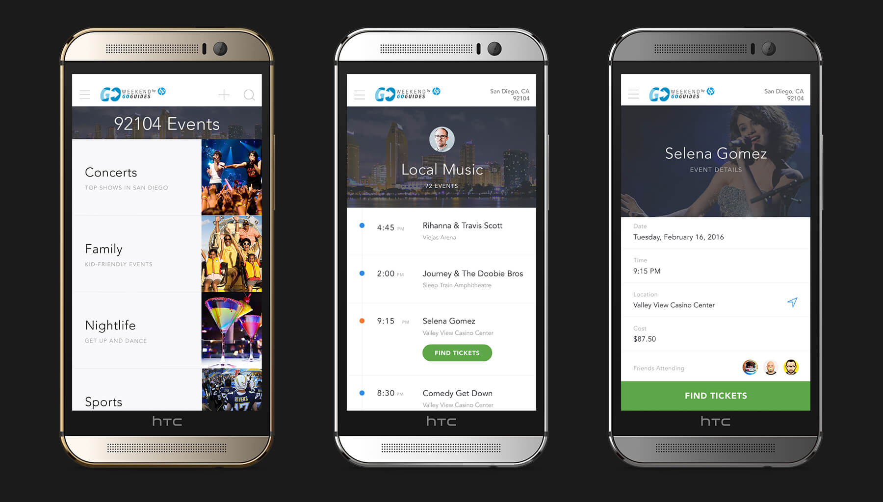
Device Agnostic Design
Mobile-first design is so much more than the structure of a website’s breakpoints. This project focused on mastery of the smaller details within a mobile-first experience such as input types, touch-friendly interactions and the user’s accessibility to content.
To deliver a truly mobile-first solution, I had to consider everything from touch-friendly form inputs to an intuitive organization of the content itself.
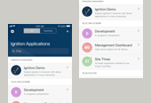
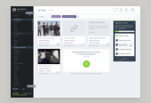
GETTING TO WORK
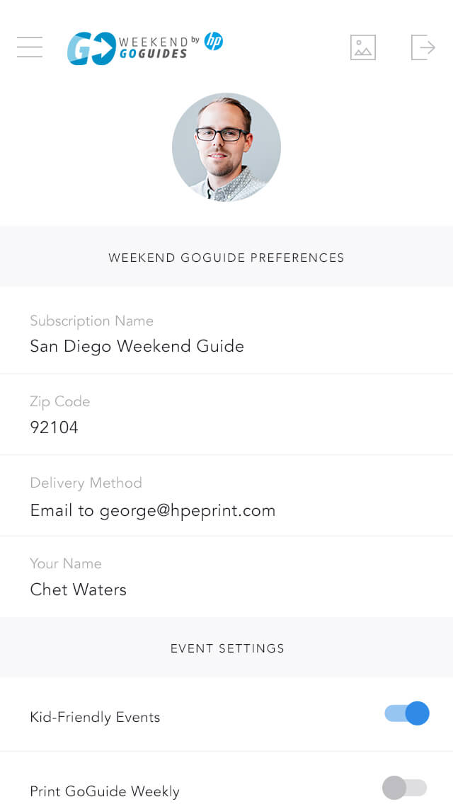
I designed the mobile app's content structure to allow users access to anything within just two taps. This structure of content hierarchy ensured nothing would be buried too deeply within the navigation and allowed for easy, quick accessibility to the content.
This was accomplished through heavy information architecture and wireframing at the outset fo the project. The organization and access to the content was key to this project's success.
Early wireframe establishing navigation hierarchy
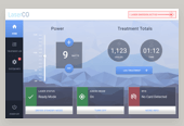
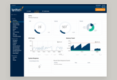
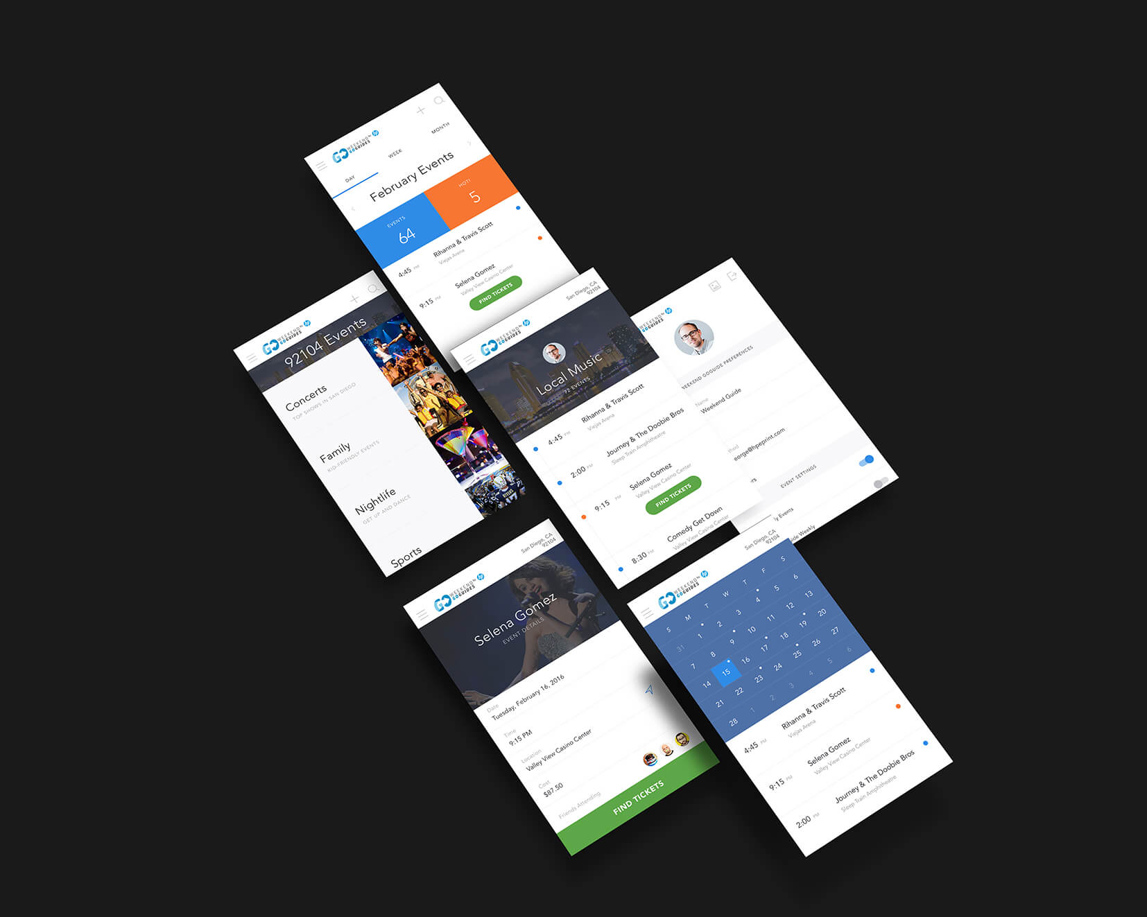
THE OUTCOME
After establishing a successful hierarchy through wireframing, I moved to the visual design of the user interface. The design itself was influenced heavily by the constraints of mobile. Large touch points, touch-friendly user input fields and an intuitive navigational system were my top priorities.
Due to the nature of this Research & Development (R&D) project, it was unfortunately cancelled before the UI designs could become a reality.
Final interface design concept
THE CHALLENGE
Responsive Design Specs
As a mobile-first website, the interface design had to be flexible enough to accommodate a variety of user devices. Our user base was fairly non-technical, so we had to expect that the devices being used would not be top-of-the-line nor cutting edge.
These design constraints meant I had to not rely upon the modern browser's rendering of CSS3 tricks or other more forward-thinking features and instead move forward with basic, mobile-first strategy.
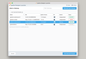
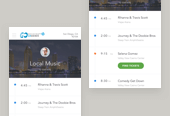
GETTING TO WORK
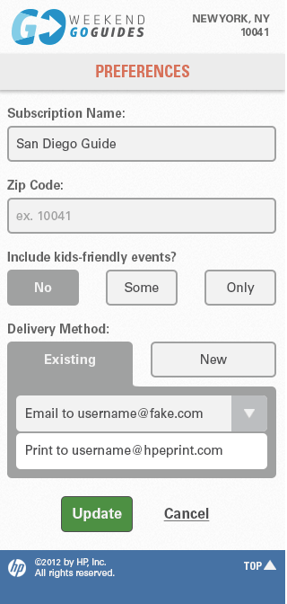
I designed various stand-alone versions of the wireframes for each breakpoint. At the time, I decided on three fairly standard breakpoints because of the site's content and the proficiency of phones, tablets and computers.
In handing off the design specs, they needed to be clearly defined between the variable breakpoints. The app was designed to scale up from the base design up to a tablet and larger, desktop version.
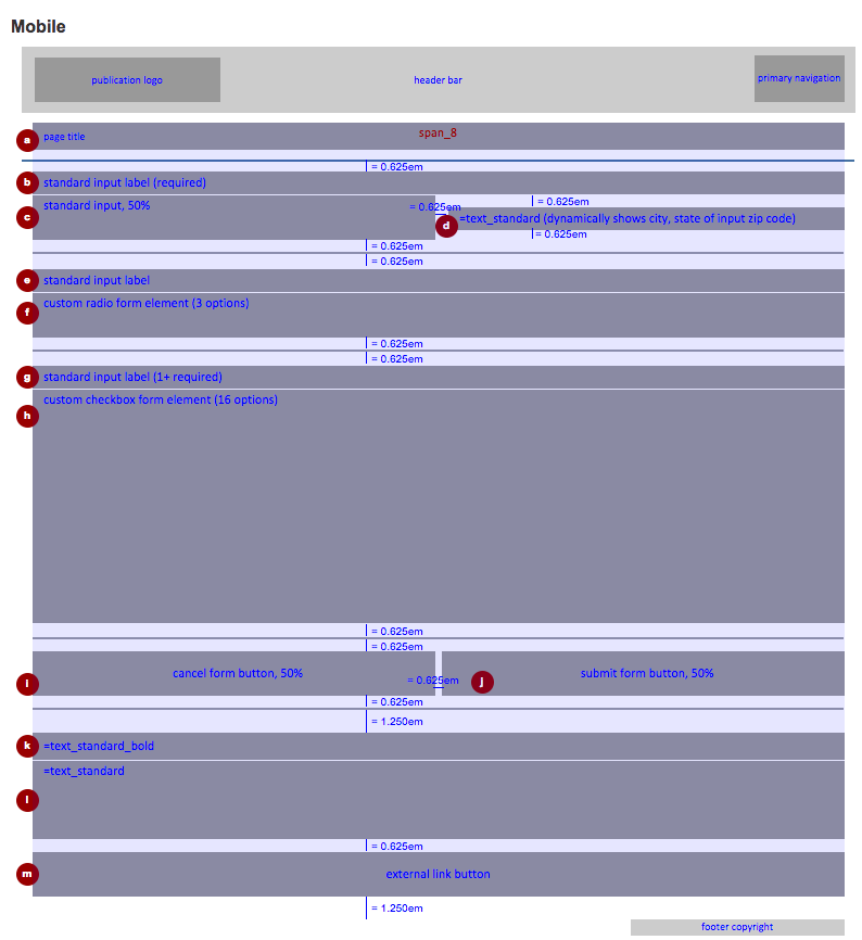
Mobile breakpoint specs
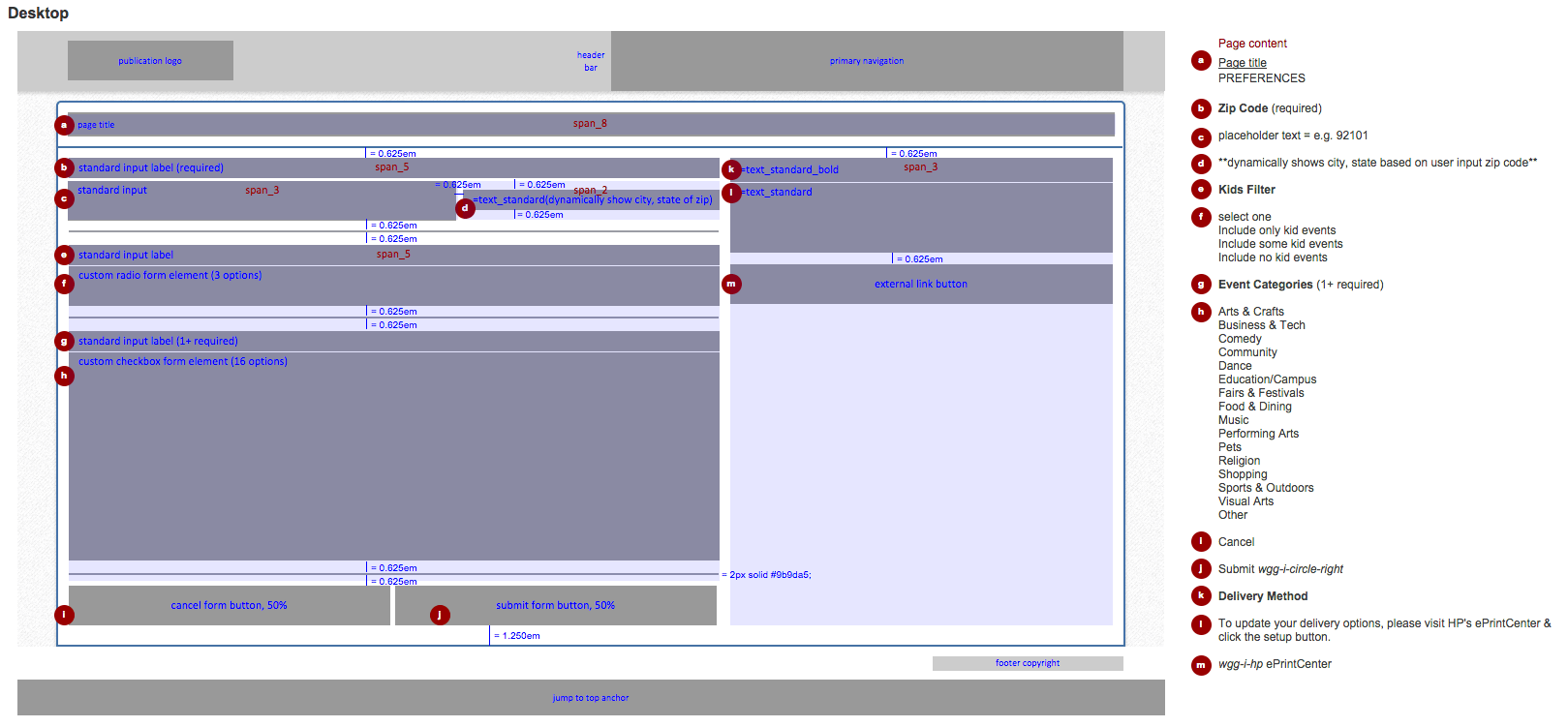
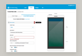
Desktop breakpoint specs
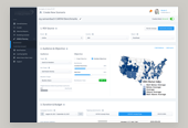
THE OUTCOME
The final solution consisted of a complete design style guide for the base elements. This ensured a consistent and systematized development of the design's core elements including colors, typography. It extended from these base elements up to larger, combined organisms such as forms and cards.
Finally, I developed pixel-perfect design specification sheets per page for the application. These spanned each defined breakpoint from mobile, tablet up to desktop to ensure a proper deployment by my development team.
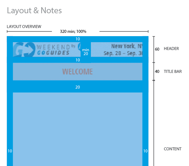
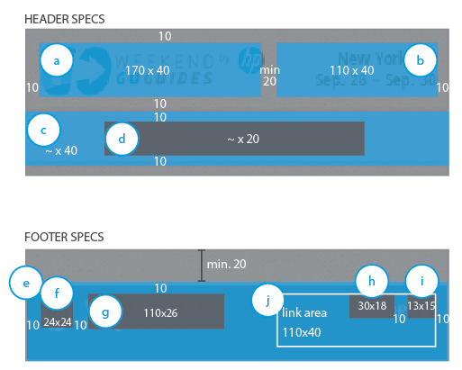
Reusable, component-based specifications
Warning: implode(): Invalid arguments passed in /home/q2jbh94teh6a/public_html/wp-content/themes/semplice/partials/project-panel.php on line 28