
How to craft and document modern component libraries
A primary point of contention in the product design to development workflow comes at the point of hand-off. As a project deadline looms, designers are typically scrambling to write specifications and export the necessary graphics to ensure the intended pixel designs are fully realized in the browser. This stage of a project is fairly fragmented industry-wide with each team doing their own thing with their own tooling. It’s a difficult stage that is regularly underestimated in terms of the time needed for proper completion.
In my experience as a product designer, front-end style guides are the missing deliverable at this stage of a product’s development. When supporting teams of developers, a style guide as design documentation is invaluable in contributing to a project’s long-term success.
When supporting teams of developers, a style guide as design documentation is invaluable in contributing to a project’s long-term success.
That said, I’d like to outline my approach to designing component-based systems with style guides in mind. Each project and the folks involved are unique, so be sure to bend and mold this process to your own situation. Design documentation doesn’t need to be perfect or even beautiful. It’s sole purpose functional, to ease the transition from designers to developers.
Approach your design with stylesheets in mind
Today’s design tools, namely Sketch and Adobe XD, are hugely beneficial to approaching design a modularly. They enable reusability of components instead of one-off designs through the use of art boards, plugins and symbol creation.
Within design files, I tend to organize components outside of their final placement in a singular layout. This typically translates to a page within my Sketch files simply titled ‘Components’. It’s a sea of art boards, each containing a unique component and any unique variations or states of that component. This is helpful in visualizing a larger design system as a whole, in one view.
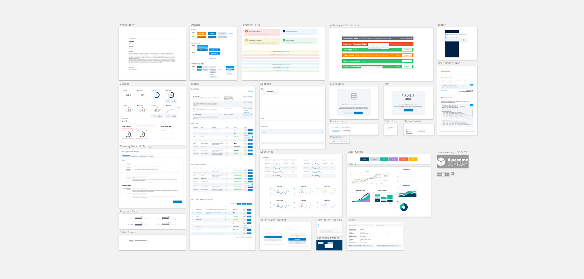
Additionally, I make heavy use of modular tools like symbols and text styles throughout my design files. This enables for sweeping design changes with singular updates as well as a tight correlation with the coming style guides code. It’s important to get specific with your naming conventions so they are clearly understandable to anyone new looking onto the project. These will eventually translate to the classnames within your style guide.
Stay away from objectively descriptive titles such as ‘red paragraph text’. This will only limit your ability to modify the visual design down the line. Something like ‘emphasis paragraph’ may be a more appropriate title. This way, as the visual design evolves, you’re able to freely adjust that emphasis text to a different color, style, font etc. Set yourself up for flexibility.
Determine the right deliverable
Vague, i know. If every project required the same deliverables, the product design landscape would be so much simpler. But, alas, here we are. At this stage you have a modular design structure and have been building out a system of reusable components. Where you go from here depends on the team you’re working with.
You need to facilitate the necessary conversations within your team to determine at what point they are comfortable taking over. Skill sets and preferences differ drastically, so talk with your unique team members and build the thing that you determine together will be the most useful.
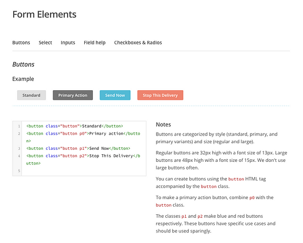
Personally, I am very comfortable with markup and presentational coding (HTML5 and Sass/CSS). Through trial and error I’ve found it’s very beneficial to the overall fidelity and speed of a project for me to personally code up a simple, two-column style guide, encompassing each of my components from the Sketch art boards.
I lead with a description of the component, what it does, where it lives and how it works. Next, I’ll use the left column to actually show the component visually. Finally, the right column gives a copy and paste-able bit of markup that my developers will need to create it.
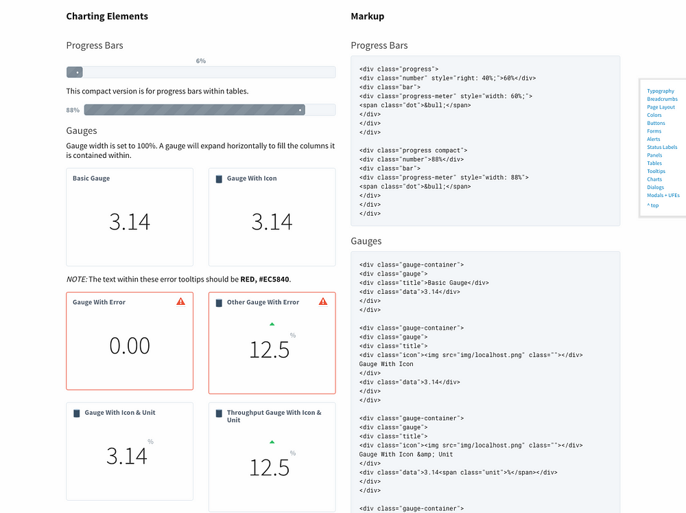
Note that this markup is usually translated further by the development team into whatever language the actual product is using; React, Ember, etc.
Document foundational decisions
With the right deliverable in mind, star at the ground floor of your design. Call out the low-level rules that make your design system work. This step is relative to the layout portion of Google’s material design guidelines. It is the structure of your layout and serves as a foundation for all future design decisions and building blocks.
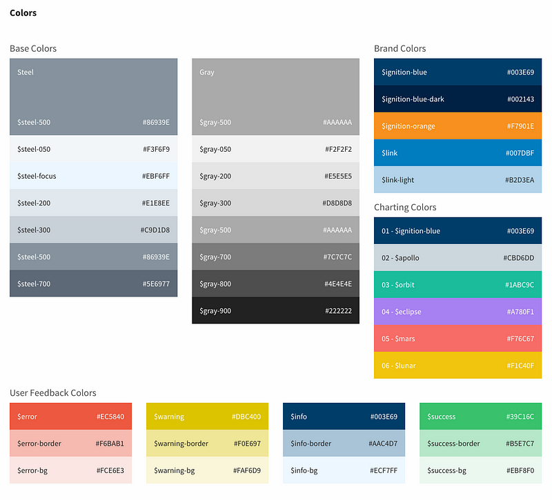
These foundational decisions may include your grid system, the site’s responsive behavior, larger structure, colors, units of measurement, etc.
It’s easy to fall into the trap of thinking these core things are obvious and not worth documenting, but there are compelling reasons to do so regardless.
- Firstly, realize that you likely won’t be on the project forever. Such documentation circumvents any assumptions and will lengthen the lifespan of the product you’re building, beyond your tenure there.
- Secondly, a future designer may generally take a different approach to these basics. Documenting the why behind your design decisions, reduced the amount of re-work that may happen and strengthens the ability of your design to remain intact.
MailChimp does a great job of bringing context to their pattern library through their extensive notes.
They describe, in detail, the decisions behind everything from the grid system through to more granular decisions of their markup structure.
The visual examples are supplemented with actual code, providing developers with an overall very powerful tool.
Organize and build the stylesheets
Once your pixel designs are nearing their debut in the actual browser, you can begin to structure your stylesheets. These will inform your team of the design’s nitty gritty specifics and ensure they are fully realized in the product.
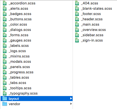
Sass, or any CSS preprocessor, allows you to break your stylesheets down into manageable chunks. For ease of use and clarity, this folder structure and the files themselves should reflect the components and art boards from your design files.
Here’s how I break down the structure:
- _variables.scss. Any base level variables that permeate throughout the larger design. This may include your colors, base typography, resets and file/image paths.
- _mixins.scss. Mixins are groups of declarations that are used throughout your style guide. Think of these as your ‘shared style’ rules in a Sketch document. This typically includes many rules including drop shadows, corner radii, alignment classes, etc.
- _component.scss. Each of these files details one component such as a button or table and each of it’s variants. Make sure to add documentation within these files via code commenting.
- /layouts. A folder containing unique page layouts and how these relate to the grid system. Here you’ll find the overall page structures, 404 layouts, and any other one-off page layout that the product needs.
- /vendor. A folder containing any 3rd party styles that I have not personally written. This is usually some grid system, iconography or sometimes even a full CSS framework like Foundation or Bootstrap.
- style.scss. This is the master file which I use to compile each other partial above into one style.css file for use in production. It’s essentially a massive import file, with very specific ordering as these build off of one another. For example, you’ll need to import the base variables such as colors and corner radii before larger components such as tables.
What I build out in the browser serves as a method of communication between design and development.
What I’ve outlined here is fairly simple in terms of front-end development, but it’s worked well for me on many products at scale over the years. The emphasis is on creating a shared understanding of the design. What I build out in the browser serves as a method of communication between design and development. Build whatever works for you and your team(s).
Annotate component functionality
Similar to documenting your base design decisions at the beginning of your style guide, it’s a great practice to document the actual intended functionality of each component. This again clarifies potential confusion between the design and development teams and leaves a reference for future team members.
With simple components and depending on skill sets, the style guide can be fully functional, or simply describe the intended interactions. For complex or multi-staged interactions, I’ve found it best to link to an external prototype which exemplifies the interaction. This way I can add complexity without the necessary knowledge of functional languages like JavaScript, etc.
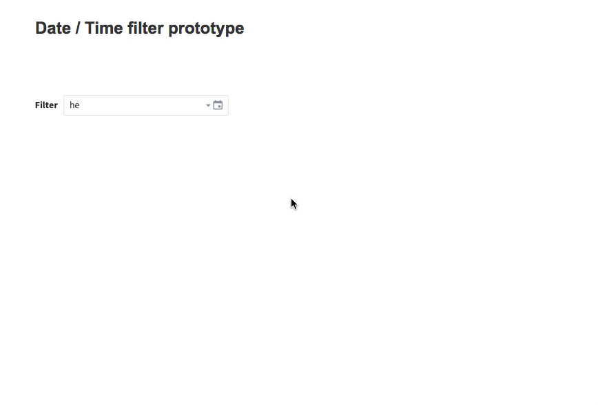
Hosted Axure or InVision prototypes are my go-to recommendations for interactive design prototypes. At a minimum, describe the interaction layer in plain text or provide visual design mocks of a component’s varying states.
Final touches and extra credit
Larger teams, highly technical designers or extended timelines may allow for more functionality within your style guides. Here are some ideas and links for inspiration for those rare cases when your design documentation gets to this level or beyond.
Syntax highlighting
Make your documentation easier on the eyes and boost time to understanding through some syntax highlighting. There are a few solid tools out there for this, but I would recommend Prism. It’s lightweight and easy to configure at a basic level.
Auto generate markup
A little more complicated, but a time-saver in the end, X-rayHTML will auto generate the copy/paste-able markup for your components as you’re building out a style guide.
Make it pretty
Notice how this is the last thing I’m mentioning here? Form follows function. Your primary goal with a design system and component library should be to create something usable by a larger team.
That said, we’re still designers here, so time-permitting you can do some pretty incredible things in terms of branding and layout to make your design documentation unique. Make that logo bigger and be sure it POPS!