Last week, I led a local workshop on designing effective software dashboards with about twenty Sacramento designers. Together, we delved into what users expectations are, how to display information instead of data by using contextual cues and other UI design tips that make dashboards effective. Here's what we discussed about the current state of dashboard design inspiration and how to blend beautiful aesthetics with useful functionality.
Dashboard design is an incredibly common problem for today's digital designer. They're found in most, if not all, software products and offer key insights for the user. Acting as a starting off point, a product's dashboard is responsible for empowering the user to make key decisions and effectively understand what's going on right now.
With that said – it's unfortunate that most inspirational dashboard designs out there today are ineffective at actually presenting information to their users. It's become easy to focus on presentation alone and design a very beautiful dashboard. However, intelligently creating one which solves a specific set of problems is happening less and less, while it's becoming an increasingly important skill to learn.
Beautiful, Useless Dashboards
I call this trend of beauty over function the "Dribbblization of Dashboard design". It's an unfortunate and ongoing trend being fueled by social and gamification features including likes, popular pages and comments.
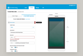
Modern and often free tools for new designers are also fueling the trend. I'm talking about UI kits, admin bootstrap themes and free website templates. These are often used as a crutch for new UI designers, filling in the gap of experience with ill-fitting visual design resources. They frequently set a poor example for what makes a good dashboard as they focus wholly on eye-catching visuals to make the sale.

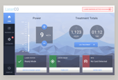
These types of dashboard are beautiful pieces of art. They're truly impressive! But again - not necessarily a good source of inspiration for a product designer seeking to craft an intentional user experience. Yet they persist as our likes and comments fuel more the social media feedback loop.
Boring, Useful Dashboards
On the other end of the spectrum are boring, yet useful dashboard designs. Coming from the complex world of industrial automation there's a theory known as High Performance human machine interfaces. This theory is all about displaying complex data in a highly organized and legible way. It's intended for folks known as operators, whose entire 9-5 job might consist of keeping an eye on and using these complex HMIs to control operations. Think of a water/wastewater plant for your entire city, a car manufacturing facility or a power plant.
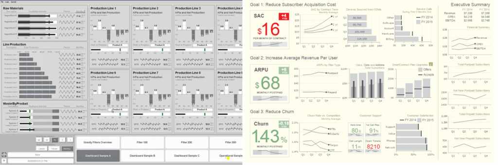
The design aesthetic is incredibly low contrast, allowing alarms and other attention-seeking bits of the UI to come to the forefront of the operator's attention easily. I would argue that for our typical software/digital product dashboard - this is taking it too far in the functional direction. We are still selling a product or service here, so we can weave some beauty into our product dashboards.
It's your job to decide where and how that blend is going to happen. Try to land somewhere in between these two styles of visual design with a focus on the product's core information design and functionality. Blending these two ideas into a beautiful, functional design will leave you with friendly and approachable software experience.
Learn more about this all by signing up for my course on Dashboard Design here.