I’ve been completely focused on designing complex web applications and dashboards for years now and I’m realizing there isn’t much education in this niche. I’m hoping to share some of the essential web application design tips, tricks and design theories with this new series–Web App Design 101.
Hit the comments if there’s anything specifically you’d like me to write about.
First — Know and Leverage User Expectations
When you’re lost in a new city, you know where to look for directions. Maybe that means street signs or building address numbers. Now imagine how frustrating it is when these conventions are broken in the real world. Similarly, your average user has clear expectations about where elements should be located on the screen. Violating these expectations should be avoided whenever possible so as to reduce any potential confusion. There’s no reason to reinvent the wheel here, layout best practices are your friend.
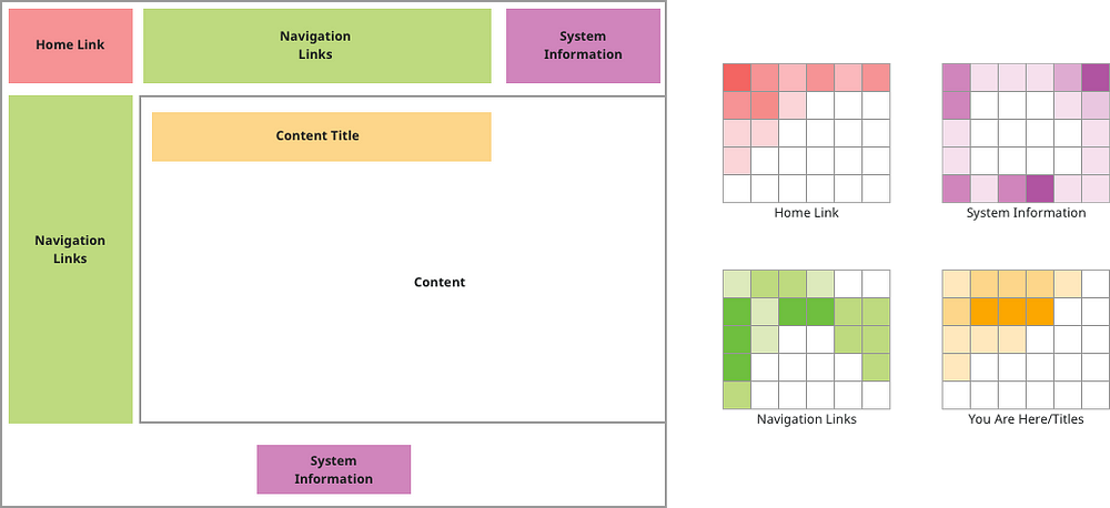
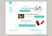
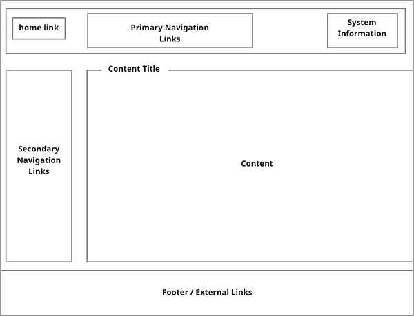
Here we can see user expectations visually, based on some eye-tracking studies. Let’s walk through what these elements are — and where your users expect them to be.
First, In red, we have our home link, or logo. You can see based on these maps that it’s expected to be in the top left corner.
In purple is what we’re calling utilities. This means maybe the time, log in/out links, or other system-level information. This is looked for in the top right and at the very bottom.
In green we’re showing navigation links. As you’d expect, folks look for these in the header and sidebar.
Finally in orange is the page title. It’s expected to be roughly inline with the content of the page.
Keep in mind this is a US-based example. You’ll want to take into consideration your user base and whether they are from a country that read right to left or is used to other common layout conventions.
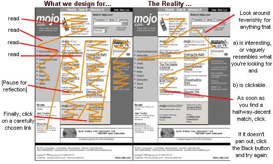
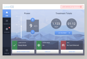
The typical user scans, clicks and jumps around screens fairly quickly. In order to facilitate this type of natural user behavior, we want our layouts to be designed as clearly as possible. Let’s walk through these four simple, but powerful layout best practicesthat should help you in designing your next project.
These include:
- Creating a clear visual hierarchy
- Breaking up screens into clearly defined areas
- Making it obvious what’s clickable
- Reducing visual clutter
Clear Visual Hierarchy
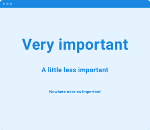
First is a clear visual hierarchy. This just means making sure that the appearance of your content clearly reflects its importance. So, the most important thing on a screen — should be called out somehow — maybe making it larger, or louder in some way.
Use your tools of color, white space, bold text or some combination of these to make this happen.
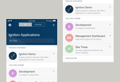
Clearly Defined Areas
Another layout best practice is having clearly defined areas. We want to give our content it’s home on the screen. We accomplish this through grouping similar content.
The goal here is to help users know where to find information. We don’t want them to hunting around our project’s screens looking for things.
A final note on clearly defined areas is to remain consistent with layout throughout your entire project. Being consistent between your layouts makes them easier to use.
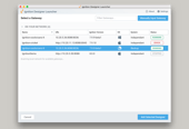
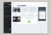
Affordance
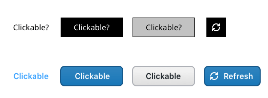
Affordance means making sure the actions and links on your screens are obvious and discoverable. When something has strong visual affordance, it means you know what it does or can do — just by looking at it.
In our graphic here, the top two gray buttons are not obvious. By adding color, underline and other visual treatments, the blue buttons are much more obvious.
If something is a button, make it look like one.
Being consistent is a nice trick here as well so folks aren’t left guessing. Make all of your links look the same and save someone a headache. Additionally. You’ll want to clearly differentiate positive and negative actions. If something is destructive, it shouldn’t look like a positive or confirmation-type action. Use colors to strengthen the buttons meaning.
Reduce Clutter
The final tip for a well-designed project layout is reducing visual noise, or clutter. When building screens, just remember that each additional element adds visual noise, making it more difficult to use. Fight and question the adding any new elements to a screen You may even find that it’s a better strategy to build out an additional screen instead.
Next Up: Navigation Best Practices
The purpose of navigation is two-fold.
- Help your user get to where they need to be
- Provide orientation for where they are now
I’ll give some tips next time on how to design navigation structures which are both intuitive and predictable, making them more user-friendly.