
Part One covered Layout Best Practices. Now let’s get into some tips on how to design navigation structures which are both intuitive and predictable, making them more user-friendly.
The purpose of a product’s navigation is two-fold.
- Help your user easily get to where they need to be.
- Provide visual cues as orientation for where they are now.
The ultimate goal of a navigational structure is for new and returning users to be able to figure out how to get around a digital product easily and efficiently.
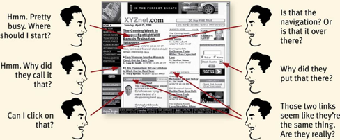
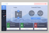
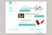
This graphic here illustrates some of the questions a user may have when encountering a poorly structured navigation.
Let’s talk now about the specifics of building an effective nav.
Categories vs. Utilities
As you build out your navigation, you’ll want to keep in mind the difference between content categories and what I refer to as an product’s utilities.
Categories are content. They are high-level links to the main sections of your product’s content categories. Utilities, on the other hand are links to important elements of the app that aren’t really part of the content’s hierarchy. This includes tools and ancillary things like help screens, product authentication, error screens or a developer’s api documentation. These are all examples of utilities, and they vary fairly widely per-product.
When you’re structuring a navigation, you’ll want to be sure you’re not mixing these two types of link in your navigation.
Mixing these two types of links in a product’s navigation causes confusion. Eye tracking studies tell user researchers that users expect these two different types of links to be located in different places on the screen.
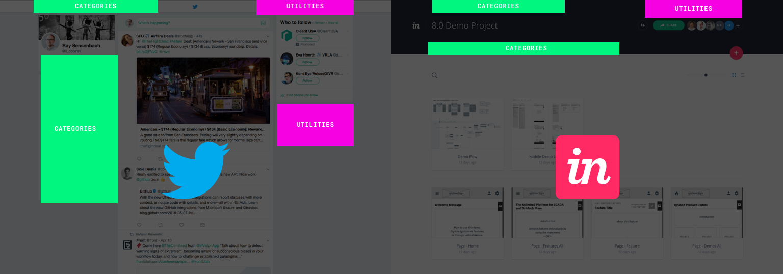
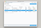
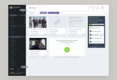
Twitter and InVision are both good examples of seperation between these two types of links in a product’s navigational structure. Here I highlighted the categories in green and utilities in pink.
User’s generally expect these types of links to be in these relative locations in a traditional web application’s layout.
The Three Most Common Navigation Structures
When it comes to physical placement of your categorical navigation, there are a few best practice “locations” within a screen’s real estate that lend themselves well to specific information architectures.
Let’s discuss the different areas of placement for your navigation. We’ll go through the top three positions, based on user expectations and space constraints.
Top Header
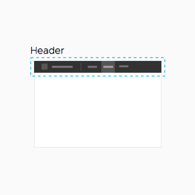
The first example is the top header placement.
This placement is ideal for your primary navigation because users look here for navigation intuitively. The header is also separated from the pages content, reducing confusion between navigation and content. Finally, the limited horizontal space forces you to organize your information clearly.
Subnavigation
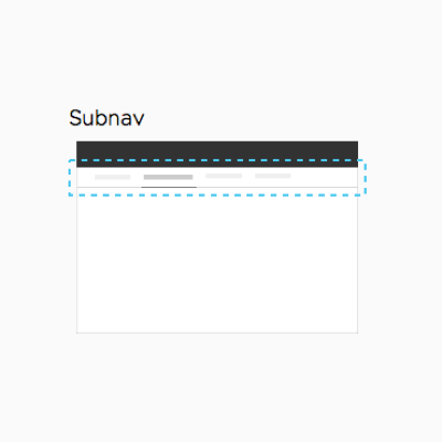
The second recommended placement is the top Subnav.
This is useful when the header space isn’t large enough for all of your primary category links.
Similar to the top header pattern, users will still look here intuitively for their primary navigation links.
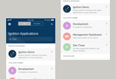
Side Navigation
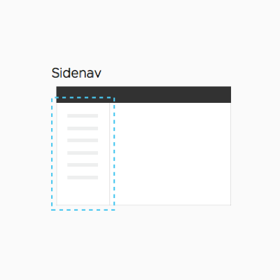
Finally, there’s the side navigation.
This is a very common pattern, especially useful when you have a lot of category content in the product’s architecture.
It’s vertical structure supports scrolling, when the list becomes too long to fit within a window.
Combining Navigation Patterns
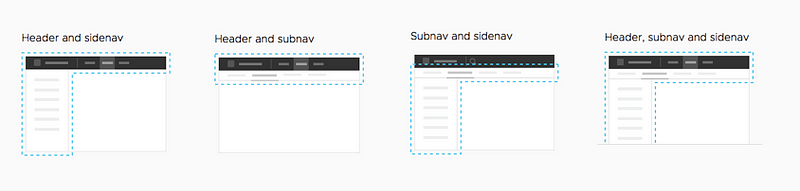
With a complex project, you’ll likely find yourself combining these placements to form your navigation’s structure.
Here are some examples of how this may come together:
Header + Side Navigation — A very common structure with the primary navigation in the header and the secondary navigation in the sidebar.
Header + Sub Navigation — Also common, but use this only when both the primary and secondary navigation will fit in the space.
Sub Navigation + Side Navigation — Here the side navigation acts as our top-level, primary categorical navigation bar. The sub navigation acts as a secondary level, within the context of each screen.
Header + Sub Navigation + Side Navigation — All of the things! A useful pattern to follow within more complex products. Here the Header is primary, sub is secondary and side acts as a tertiary set of categorical navigation.
There’s really no limit to what you can do — just be sure to keep a clear hierarchy and not add any unnecessary clutter. Keep in mind that it’s not recommended to use more than three levels of navigation, and two, plus a contextual search feature, is almost always enough for a typical software product design.
Specific Navigational Components
Outside of a project’s top-level navigation structures, there are other common interface components, each with their pros and cons. Let’s discuss these now:
Tab Bars
Tabs are a great navigational choice for large applications because they are so intuitive. Anyone can look at a tabbed interface and understand how it works, they’re hard to miss.
They also suggest a physical space by creating the illusion that the active tab is being brought to the forefront.

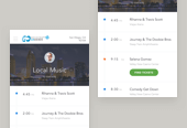
Here you can see the first tab is active while the second and third are clickable. The 4th is disabled, and not active.
Tabs also work vertically, if your space doesn’t allow for them to all fit across a screen horizontally.
Dropdown Menus
These are used very often —generally because space is a limited commodity on our product interfaces. However, they suffer from usability problems and are not recommended for use as a navigational tool. This is because users must seek them out, they’re difficult to scan (all options not visible at once) and long lists are also difficult to decipher.
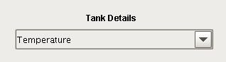
That said, they can be effective for alphabetized lists where the user doesn’t need to think about the options such alphabetized lists like states or countries where your user doesn’t need to think.
File Trees
The file tree is a classic component which we see being frequently used for complex navigation structures today. In general, it can be used for larger, desktop focused applications, but is not recommended for anything that would need to be touch-friendly. Those tiny arrow icons can be tough to click even with a mouse.
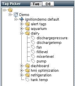
Using them as a primary navigation is generally discouraged because they faced with a few additional usability problems. These include running out of horizontal space which causes clipped text or an awkward horizontal scrollbar. Finally, they can lead to user confusion because folders are collapsed, leaving the user unsure of what all of the options available are.
If you enjoyed this article or learned a bit — keep in mind that I’m authoring a course to teach product designers how to craft effective dashboards which solve business problems.
Sign up now for a deal and to get notified when the course launches in 2018.
Cheers!