

A Brief Information Architecture Primer
Recently, I co-delivered a webinar detailing the basics of information architecture, specific to the design of human machine interfaces (HMIs). We discussed the basics of Information Architecture (IA) and the benefits made possible when you add or invest in an information architecture stage for your product/project. The primary benefits being 1) Meaningful content organization and 2) Intuitive layout organization. I’ll be writing in detail about each of these subjects shortly, but for now let’s focus on IA itself.
This is a quick primer on the subject and the concepts involved – I’ve worked to distill down a ton of information into simple, actionable concepts for you. If you’re interested in more depth–grab a book–but for now, lets get started!
What is Information Architecture?
The structural design of shared information environments; the art and science of organizing and labelling websites, intranets, online communities and software to support usability and find-ability.
🙄
Like most technical fields, Information Architecture tends to overcomplicate even the simplest of concepts.
A better definition for it is:
Connecting people to the content they’re looking for.
Phew – much better. So, if IA is all about connecting people to the content they’re looking for, where can we see an example of it in our everyday lives?
An everyday example
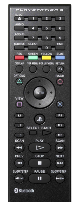
One example is that terrible remote control for that one crappy dvd player you have hiding in your house. You know the one I’m talking about: you won it at your company’s Christmas party, it doesn’t work unless you stand right in front of the player, and worst of all the buttons buttons on the physical interface itself make no sense.
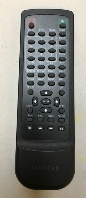
Like this one I have at my place: first, where is play button? Where is pause? Why is so much space given to the number buttons that I’ll never use? And why is the most prominent button the eject button?
It has every function that you could ever need, but its impossible to find what you’re looking for.
What this remote lacks is proper information architecture.
Contrast that with this other remote control:
As soon as you get your hands on it, it’s a lot more natural of a fit. Why is that?
It’s using tools like grouping, color, hierarchy and shape to help convey the meaning and importance of these buttons.
It’s still complex and can accomplish quite a lot, but it’s easier to use.
This is what well-designed information architecture will bring to your interface.
Information Architecture is Everywhere
Once you start to think about it, you realize that information architecture is all around us.
It’s the driving force behind things like:
- Roadway signage
- Every website you’ve ever visited
- Instructions on prescription medication bottles
- Exhibits at museums
- Ballots and voter information guides
- Every book you’ve ever read
- Even presentations like this one!
So we ask ourselves, what do all of these things have in common?
Information Architecture is Way Finding
They are all used for way finding, in one way or another
Information architecture helps us to navigate through complexity. It helps to make our interfaces intuitive and easy to understand.
An interface with solid information architecture should help to convey to us:
- Where we are
- What we’ve found
- What’s around us
- What to expect
- Where to go
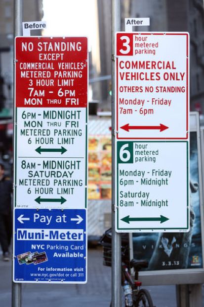
This image shows a recent redesign of NYC street signs. They use a lot of the concepts we’ll discuss next to clear up a ton of frustrations and confusion, leading to parking tickets and lots of frustrated people.
Now that we have a better understanding of information architecture, we’re ready to dive into the two main subjects which bring about the real benefits for our products. I’m talking about crafting meaningful content and designing intuitive layouts around that content. Those articles are set to release shortly :)
A sincere thanks to my co-presenter Steven Fong for collaborating on this presentation and the content structure. I couldn’t have distilled down these concepts so nicely without Steven’s time and thoughts.