Insights from the other side
Hiring UI/UX designers is difficult. Finding the right position as a UI/UX designer is also hard. While reviewing a few hundred applicant resumes for an in-house, mid-level UI/UX position, I gained some interesting insight into the design of an effective resume.
I hope that these tips and best practices will help you to stand out as a designer and avoid many costly errors in telling your professional story to your next potential employer.
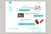
Don’t end up like Charlie. Keep reading.
You may be thrown out of consideration for a position before being properly evaluated as a candidate because of common usability issues with your resume. With that, let’s get into the meat of this article. Here’s how to design an effective UI/UX resume in 2018.
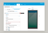
Include a link to your design work
As a reviewer, this is where I started with each resume review. I need to at least glance at some work, so I can get an idea of the baseline skills we’re working with. We’re just getting started on our hiring journey together, and I need to establish that baseline to make sure neither of our time is being wasted. I’m not doing an in-depth review of your work, but I need to know if you’re a general fit for the type and level of position that’s being applied to.
Suggestion: Try out a Dribbble or Behance profile to provide a high-level look into your design work and process. This is a great way to get a lot of quality work examples published quickly, with fairly low overhead. With so many free, hosted solutions, there’s really no excuse to not have some work online!
Give me a shout in the comments if you need a Dribbble invite, I have a few at the moment✌️.
Be sure to print the full URL of your portfolio. Interactive PDF links are nice and fancy, but you can’t assume that the resume reviewer will get it in a digital format. When these come across a desk, printed, the reviewer is forced to be sat looking at a printed link that says ‘Portfolio’ (probably with a frown). This gives your reviewer more work to do, never a good thing.
Make sure the link to your work is active
Now, this may seem redundant and silly but if you are including a URL to your work, make sure it’s not a dead link! Nothing is worse than taking the time to review a resume, decide to look at the applicant’s work, then end up at a dead URL or parked hosting landing page. This immediately makes me think you don’t care enough to test your own work and ensure the experience will be seamless for your users (me, the resume reviewer).
As UX designers, the experience is our job folks!
Keep it short
One or two pages is plenty of space to fill in a resume. If you disagree with this seemingly arbitrary length limit, let’s put on our “UX caps” and consider the user here. This person already has lots of work to do and is definitely looking at resumes in batches. Once they get to the third or fourth page during a quick review, they begin to naturally forget your intro and what you’re all about from the first page. Get yourself past the first round of hurdles by making your personal data as simple as possible for the reviewer to comprehend.
If you’re sitting on a massive resume and are unsure of how to reduce the size, here are some methods.
Iterate on your layout
Try reducing your font sizes (don’t go too small, 10pt is a good minimum), removing your huge personal monogram, or get creative with your layout design. Try including space-saving components like bullet lists and multi-column layouts.
Treat this like a digital product and explore multiple hierarchies and layouts that can best accommodate the content you have to work with.
Shorten your work history
Work history is a tricky thing. While I understand the desire to show everything on a resume, this is what LinkedIn is for (if LinkedIn really is for anything). I’ve came across resumes of experienced professionals with their last 15 positions, spanning 30 years!
Keep your past experience to just a few key positions that relate to where you’re applying.
At a certain point, that old work history is just useless information for me. The technologies and tools are out-dated and in most cases it’s in a different industry all together. If you must include some ancient position, please summarize in a few sentences, while leaving off the needless specifics.
In the case of an entry-level position or a student just out of school, you may have no professional design experience. In this case, write something about why you want this job, what motivated you to send in the resume for the position, etc. Get creative! Show some side projects, work you did just for fun or describe what you’re passionate about building and why. Something is always better than nothing.
Be honest
I reviewed many student/entry-level UI/UX designer resumes. Many of these claimed to hold positions such as Creative Director, Art Director, CEO, etc. While titles like these may seem impressive or flattering at an industry mixer, this just causes confusion for the reviewer when you’re knowingly bending the truth. When your design’s work quality doesn’t match the job title on a resume, the reviewer is forced to do research and dig around more to fully understand the context. Again, never a good thing to make the reviewer do work, so just be as honest as possible with your information.
Most titles imply a level of seniority that your work examples must support.
I’m not trying to be rude, but these titles take years and years of industry experience to earn. Most job titles imply a level of seniority that your work examples and case studies must support, to avoid confusion. Everyone wins with honesty, you wouldn’t want to land a job you’re not suited for! You’ll be found out very quickly in a fast-paced, demanding environment.
Include your current location
It’s helpful to have your current physical location of residence listed on the resume. If you’re from NYC and applying to my company out in CA, the reviewer may initially wonder whether you’re aware of where the company is located. Did you just blast out the resume everywhere, or are you specifically looking to move here?
Including your location, plus a quick note about the openness to a move specifically removes this issue for the reviewer. This also tells me that you’ve sought out my company specifically and put more thought into the application. Again, apply your UX skills and make this experience as straightforward as possible for your reviewer.
Drop the reviews and references
I understand, as a user experience designer, you learned early on in your career about the power of social proof. However, this has a proper time and place, and unfortunately your resume is neither. This isn’t a SaaS product where the social proof is tactfully placed in a user flow, encouraging me to move forward and take action.
If references are being checked on for a position, I’ll reach out to the candidate and ask her to provide some. Also, as I mentioned before your reviewer will be looking you up online, this includes your LinkedIn profile and personal website. That is the right place for reviews and references from past clients, employers or colleagues.
Title the file something useful
The filename of your resume itself should be useful. Don’t just call it Resume.pdf! This may work in your context, but please consider others contexts as well (this is out job, right?) Ideally, it should include your name, the position you’re applying for and the year in which you’re applying. The year is optional, but I find it makes the resume feel very up-to-date, even if it hasn’t changed in a few years. It’s also nice for me to track my changing resume over the years and keep things organized.
While we’re on the subject – your resume should be a PDF. This is the best, most universal file format for a resume. No need for details here, just use that.
A good example of a resume filename might be: RaySensenbach_UIUXdesigner_2018.pdf
Finally, consider your holistic online presence
Outside of the physical resume, it’s important to maintain an online presence of some sort as well. In our industry, there are so many ways to remotely interact with the community online. Throwing up work-in-progress design on Dribbble, writing a quick article about something you just learned on Medium/YouTube or posting your music to SoundCloud are a few of infinite possibilities. While this doesn’t always influence the decision, it can be super refreshing to see the personal side of an applicant online before bringing them in for an interview.
It’s refreshing to see the personal side of an applicant online.
Hiring is more and more about the whole you. Professional skills are required to get you in the door, but your soft skills, personality and team fit are important as well. Think about it, we’ll be spending ~40 hours a week together! I’d like to get to know you. What are your hobbies outside of the workplace (hiking, music, art project, TV shows, whatever)?
That's it for now! Happy hunting.