All Posts in Responsive Web Design

05/09/2018 - No Comments!

Navigation Best Practices — Web App Design 101

Successful navigation orients users and empowers them to move efficiently.

Part One covered Layout Best Practices. Now let’s get into some tips on how to design navigation structures which are both intuitive and predictable, making them more user-friendly.

The purpose of a product’s navigation is two-fold.

  1. Help your user easily get to where they need to be.
  2. Provide visual cues as orientation for where they are now.

The ultimate goal of a navigational structure is for new and returning users to be able to figure out how to get around a digital product easily and efficiently.

Read more

03/22/2017 - No Comments!

Design for Style Guides

How to craft and document modern component libraries

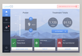
A primary point of contention in the product design to development workflow comes at the point of hand-off. As a project deadline looms, designers are typically scrambling to write specifications and export the necessary graphics to ensure the intended pixel designs are fully realized in the browser. This stage of a project is fairly fragmented industry-wide with each team doing their own thing with their own tooling. It’s a difficult stage that is regularly underestimated in terms of the time needed for proper completion.

In my experience as a product designer, front-end style guides are the missing deliverable at this stage of a product’s development. When supporting teams of developers, a style guide as design documentation is invaluable in contributing to a project’s long-term success.

When supporting teams of developers, a style guide as design documentation is invaluable in contributing to a project’s long-term success.

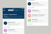
That said, I’d like to outline my approach to designing component-based systems with style guides in mind. Each project and the folks involved are unique, so be sure to bend and mold this process to your own situation. Design documentation doesn’t need to be perfect or even beautiful. It’s sole purpose functional, to ease the transition from designers to developers.
Read more

01/29/2015 - No Comments!

Mobile Testing w/ Edge Inspect

repeat-devices

Adobe Edge Inspect

Edge Inspect is an excellent application for web developers and designers alike who need to preview their content across multiple mobile devices. It makes a once manual and fairly painful process relatively quick and seamless. Its most notable features include the ability to navigate a the web from one machine with many mobile devices following, snapping mobile screenshots and inspecting the code on mobile screens. All of these features combined end up saving much valuable product design time.

Read more

08/18/2014 - 1 comment.

Sass for Web Designers

Wow - another great book from the folks over at A Book Apart. After reading most of the series up until now, I was more than excited to hear of their newest release - Sass for Web Designers. If you’re not familiar with this series of books, I cannot recommend them enough. They are, as told by ABA themselves, brief books for people that make websites. They act as quick, concise reads that can ramp up a new skill for a web designer of any skill level.

Read more

08/16/2013 - No Comments!

Strengthen Your CSS Layout Skills

All skills will be forgotten without regular practice. When I think of all the facts and skills I've memorized at some point in my life for a test or one-time exercise, it's truly baffling. While I'm sure this knowledge is rolling around in my gray matter somewhere, my knowledge of the path leading to it has been lost for years.

Read more

07/16/2013 - No Comments!

Responsive Retrofitting, Case Study

With or without justin productions logo

Recently, I revisited a side project website that I had built for a close friend of mine some years back. I'd originally used WordPress as a content management system; being that my friend had experience with it and an intention of blogging as a creative outlet. Since crafting the original design, I've learned a lot of new & powerful CSS skills. Most importantly, a working knowledge of responsive web design and some advanced CSS3 properties. I'd been looking for an outlet to apply these new skills, and decided to revisit this project.

Read more

05/30/2013 - No Comments!

Multi-Device Web Design & Beyond

San Diego Web Design Conference

On the final day of San Diego's 2013 An Event Apart conference, Luke Wroblewski delivered an all day workshop on multi-device web design. Luke managed to deliver a consistently captivating presentation throughout the seven hour workshop. He presented a vast amount of information, (nearly a 250 page workbook!) and practical methods for putting these responsive web design techniques to use. Most importantly, he spent much of the session discussing the history of this interesting subject, imparting the knowledge of how we got this point, justifying the current need for multi-device websites. Here are my notes from his session:

Read more

03/20/2013 - No Comments!

Responsive Web Design Bootcamp, Notes

In his webcast Responsive Web Design (RWD) Bootcamp hosted by O'Reilly Books, Jonathan Stark introduces the core concepts behind RWD and his recommended best practices for getting started in this evolving movement. Jonathan has authored three O'Reilly books including Building Android Apps with HTML, CSS & JavaScript & Building iPhone Apps with HTML, CSS & JavaScript.

Read more